
 |
| Hosted by the Broke and the Bookish! |
Ten Book Cover Trends I Like and Dislike
Yay for covers! You know, I don't think I've paid more attention to covers until now, because of blogging! But trends? Hmm I'm not sure if I've noticed any trends. WAIT, nevermind I see where this top ten topic is getting at! Okay, I will try my best with this topic :D
my likes


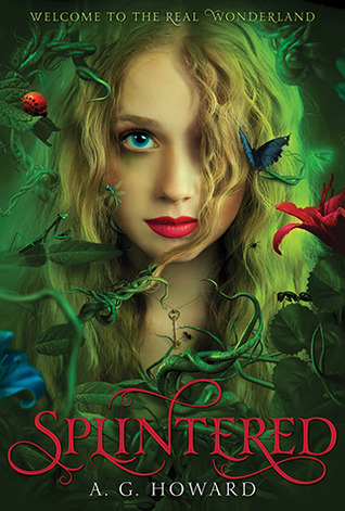
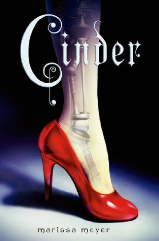
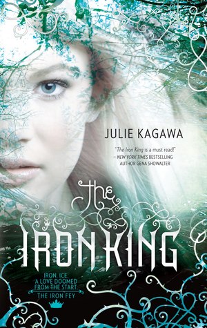
Those covers that have the main character, or at least what's supposed to be the main character, in the center of the cover.

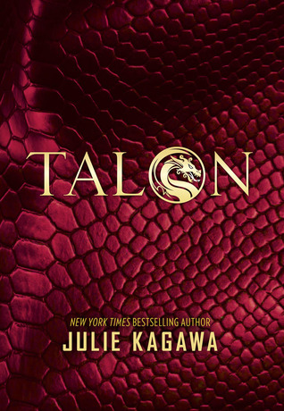
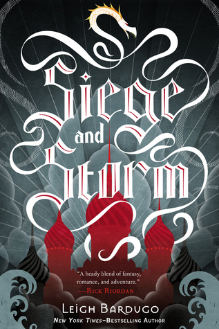
And also the ones with just the fancy title in a fancy font against some sort of background, making those covers look elegant or minimalistic. Look at that font for Siege and Storm, there's even a little dragon on top! And TALON! So simple yet it looks so badass.
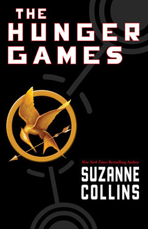
The special symbol! Along with the title obviously. The font definitely has to fit for me to like the cover though.

A scene or character from the book illustrated with a ton of colors. These covers are my favorites, because usually the art for them is amazing. :D
my dislikes

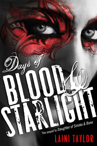
Ones where only half of the face is showing of the main character. I don't know what it is with me and faces, but I just don't like them! Though I do like the eye decorations for Days of Blood & Starlight. BUT STILL.

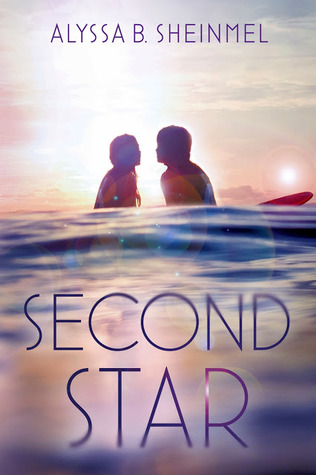

Covers showing those lovey-dovey couples. Well I don't have anything against those, I just tend to avoid those books like the plague for some reason. I should probably read more contemporary though.
How about your thoughts on cover trends? Link up your TTTs below! I'm curious to see what other trends there are out there.
I'm not a fan of lovey dovey covers either. They really don't encourage me to pick up a book. I do love interesting typography though.
ReplyDeleteI'm glad someone else struggled with this topic! I had to employ Chami to help me early this morning before the post was scheduled. I think I agree with pretty much everything you've said. I absolutely adore the Grisha covers, I think they are my favourite out of all the ones you mentioned.
ReplyDeletex Ely
Yes this was kind of a hard topic! And yes the typography for the Grisha covers are amazing!
DeleteI also hate the lovey-dovey couples. It's so overdone and cliché, and can be awkward to look at.
ReplyDeleteThe typography covers are also a love of mine. Good typography is such an underrated artform.
My TTT
I'm not so fond of the kissy covers either. It makes me think of the Princess Bride and just ask, "Is this a kissing book?" Aaaand it usually is. -_- I do love those symbols! Mainly...The Hunger Games. Although I think a lot of books have ridden on THG symbol success...like Divergent. ;)
ReplyDeleteMy TTT!
Yeah, I feel like it was THG that started the whole trend :D Which may be a good or bad thing.
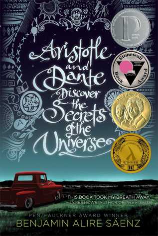
DeleteTypography! I should've included Aristotle to my post. :)
ReplyDeleteI'm getting so tired of the lovey-dovey... I like how Eleanor and Park has the couple on it, but no PDA
ReplyDeleteThe Daughter of Smoke and Bone series US covers are just so bad. So, so bad. And I love the books. It just doesn't represent the book for me. It undersells it by a lot!
ReplyDeleteAhh you're totally right, they should've made better covers for those. Although I don't think I'm a fan of either UK or US version.
DeleteI'm not a fan of the lovey-dovey either!
ReplyDeleteCora @ Tea Party Princess
I really like the minimalistic covers, like Ruin and Rising! Clean and stunning!
ReplyDeleteMissie @ A Flurry of Ponderings
I agree with your choices and, I must say, I kinda have a soft spot for Winterspell...That cover just calls to me and I'm very curious about the book!
ReplyDeleteI'm a new follower via GFC and Bloglovin' :)
Looks like we have pretty similar tastes in covers! :D I'm not much of a visual reader, so I don't picture characters or scenes in my head while reading, so having a model of the MC on the cover is definitely a plus. But only if the model actually fits the character description. Having a blond girl when the character is brunette just makes my blood boil! And YES to fancy fonts! I really wish I had their skills so I could create beautiful fonts for myself to use, too. T_T
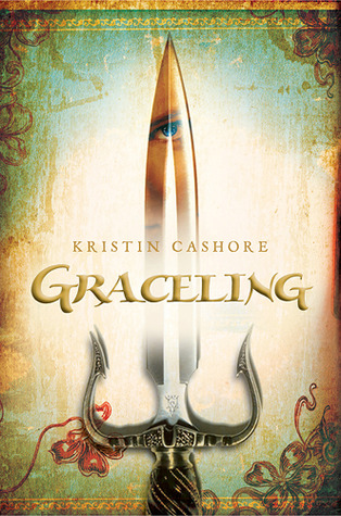
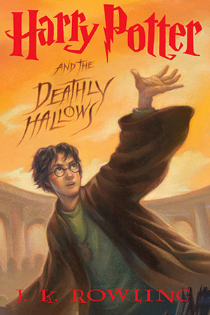
ReplyDeleteHm, I'm a little on the fence about symbols, though. They're good for making a book memorable, like THG or HP, but when they catch on and everyone starts using it, then that's just no. It's like every fantasy book cover nowadays has a sword on it, ever since Graceling became popular. If publishers think that just a sword is going to attract readers because of Graceling's success... they're in for a huge disappointment.
Lovey-dovey covers -- nope. And I don't need a reason for that! ;P
Yeah, I think only symbols that aren't a copy of other books will work. I recently reviewed a book called Paradigm, and its cover almost looks the same as the one on Divergent. Like really. I didn't get the reference to the "symbol" either.
DeleteI really like minimalist covers these days, so I love those with a beautiful title and a vague background, or with symbols. I also have a soft spot for the ones where there are pretty dresses, I don't know why, I just do. Like the Selection, for example (though my favorites remain the ones from the Luxe series, I find them gorgeous).
ReplyDeleteI'm not a fan of lovey-dovey covers either (and apparently, we're a lot to feel that way). Another thing I really hate is when there are photos of characters on the covers. Drawings or things like that, I don't mind. But when there's a picture of a character, I just can't. (Like the ones for Pretty Little Liars? I can't even look at them)